01Legacy fans
Recognition first, context second.
For viewers there for a familiar Batman. The copy opened on what they already knew, then said why it mattered in this film.
Ends at a showtime
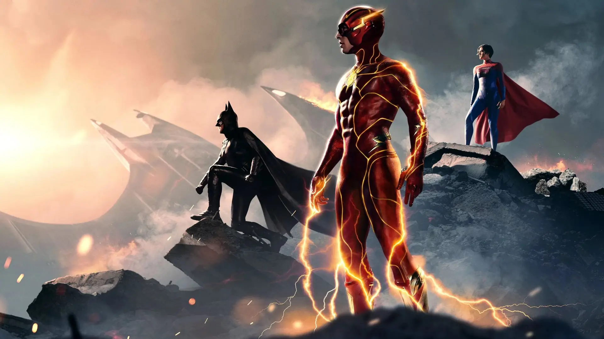
A returning Batman, a larger-than-life spectacle, or a premium-format screening. Copy that connected each reason to watch with the ticket information.
Some viewers wanted to see the returning Batman. Others wanted the spectacle or were choosing between standard, IMAX, and Dolby screenings. I wrote separate versions around those interests, each with a direct route to ticketing.
I gave each placement one reason to watch, rather than asking every ad to summarize the film. That kept the opening clear and left room for the practical details.
Three audiences meant
three first lines
Fans of the returning Batman got recognition first and context second. People there for spectacle got copy that stepped aside for the footage. Premium-format buyers got a reason to pay more for a ticket. Each placement carried one invitation, and each ended in the same place: a showtime.
Four pieces of the release, from the legacy-character work to the display assets that carried the campaign through the pre-release window.
For viewers there for a familiar Batman. The copy opened on what they already knew, then said why it mattered in this film.
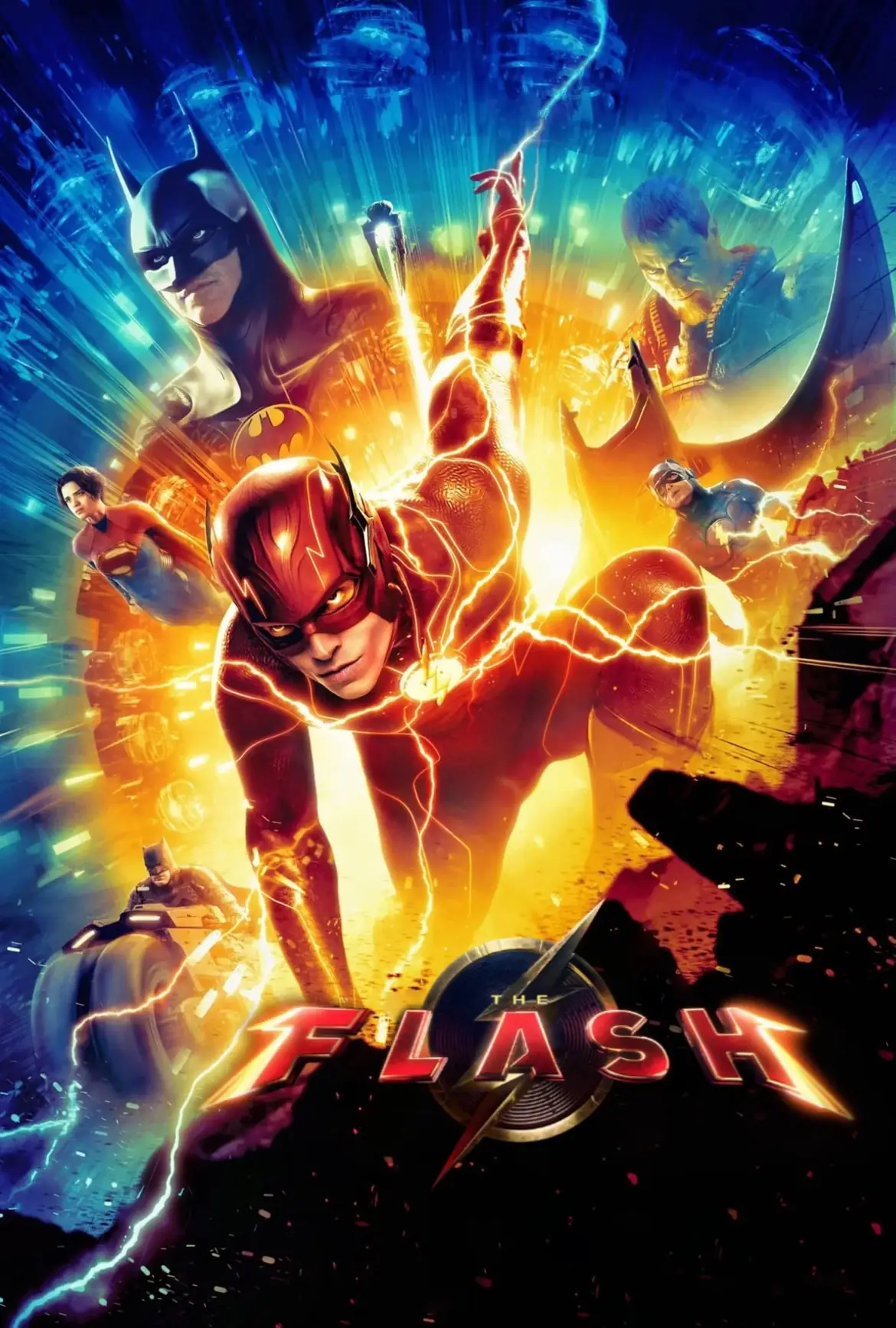
For viewers there for scale. The footage carried it, so the copy pointed at what to watch for and kept release information within reach.
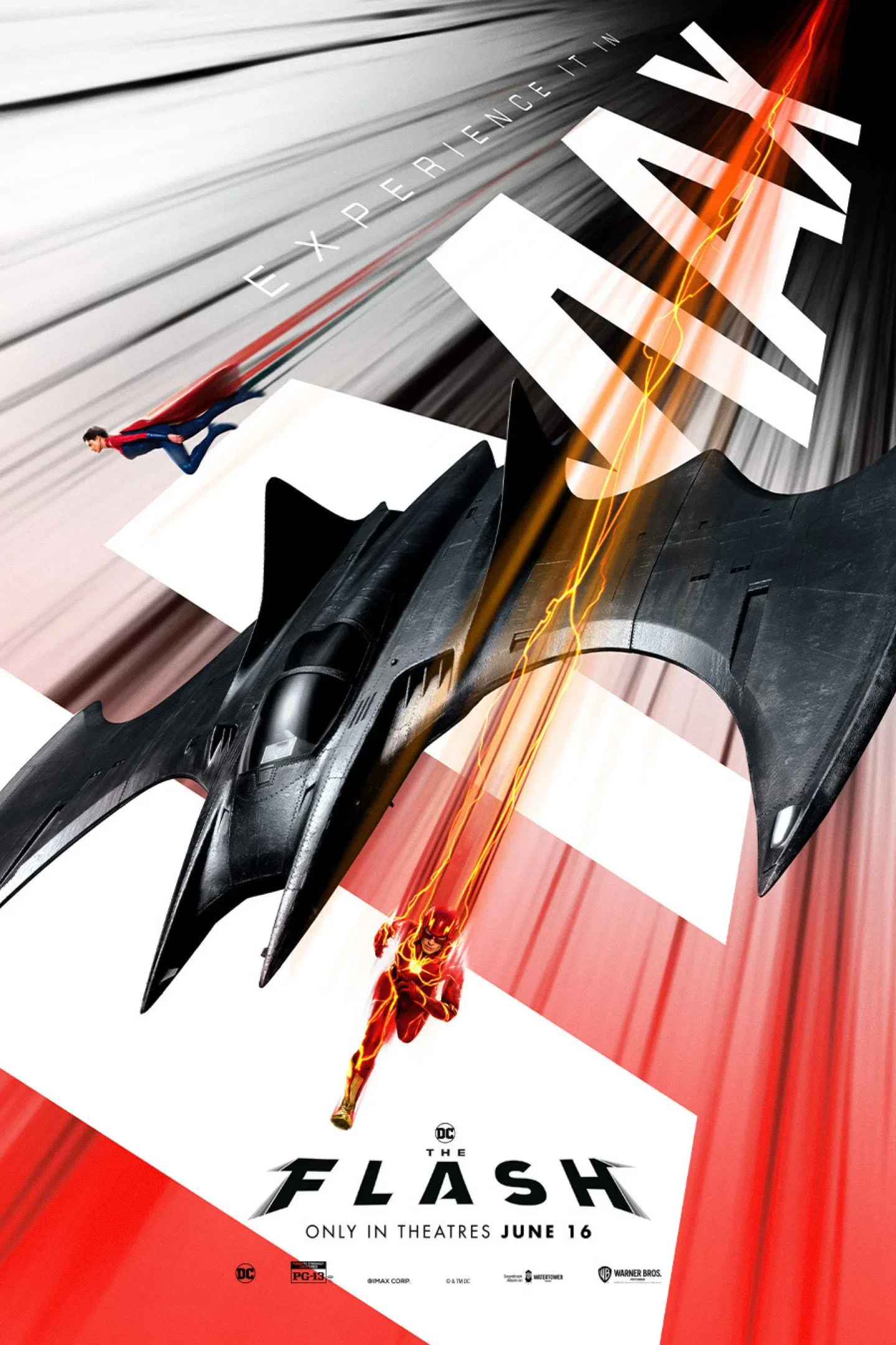
For viewers weighing IMAX or Dolby. The copy named the choice, showed what the format added, and kept the ticketing language plain.
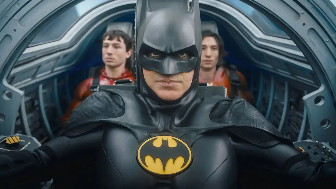
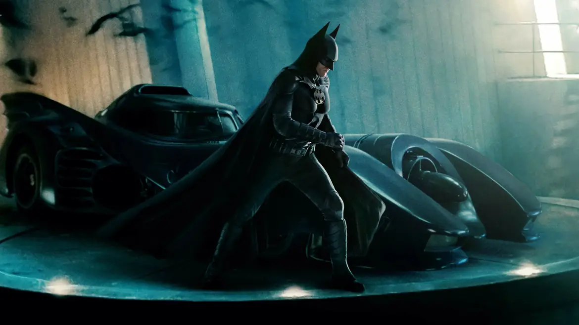
I wrote the returning-character copy with enough context for a casual viewer to understand the appeal. Longtime fans could recognize the character without every post becoming a franchise history lesson.
Spectacle worked differently. The footage carried the scale on its own, so the copy stepped back, pointed at what to watch for, and kept release information within reach.
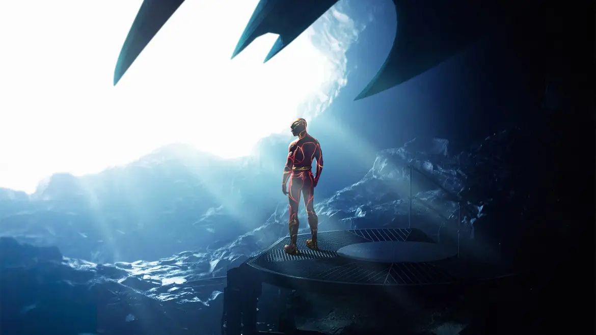

IMAX and Dolby messaging had to help with a real decision: which screen, and whether it was worth the higher ticket price. I tied that copy to the images and moments that showed off the format, then kept the ticketing language plain.
Anyone weighing a premium screening could see the choice and where to make it.
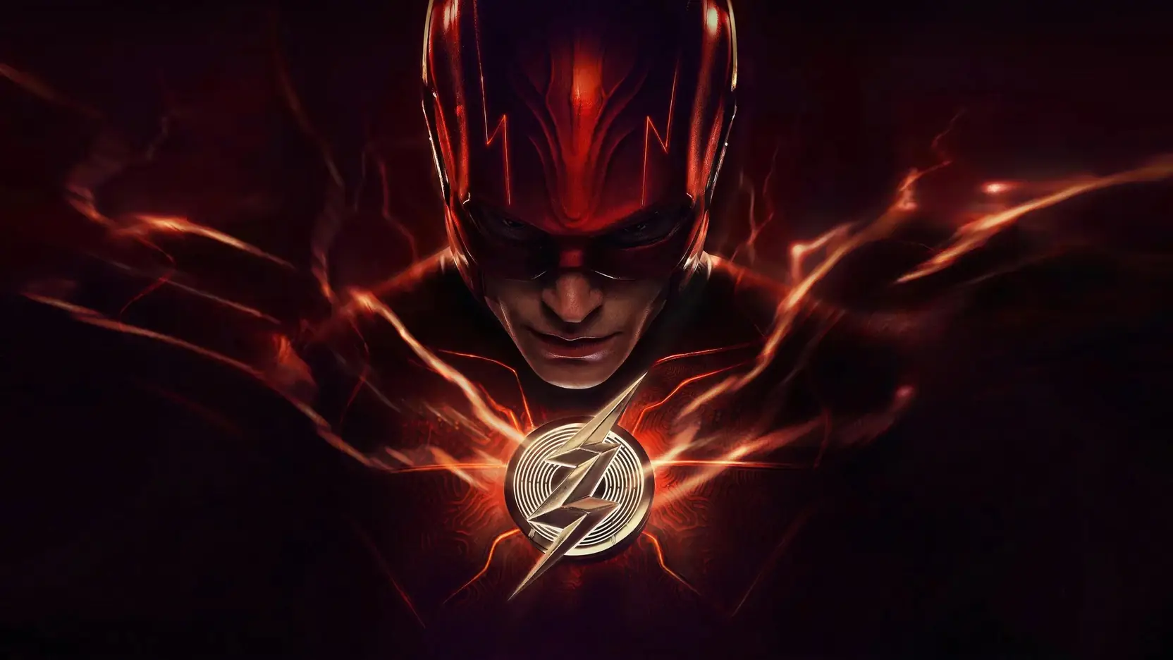
The final trailer opened a short window when interest peaked. Ads went live against it right away, each built on one of the three invitations, with the presale link in reach from the first line.
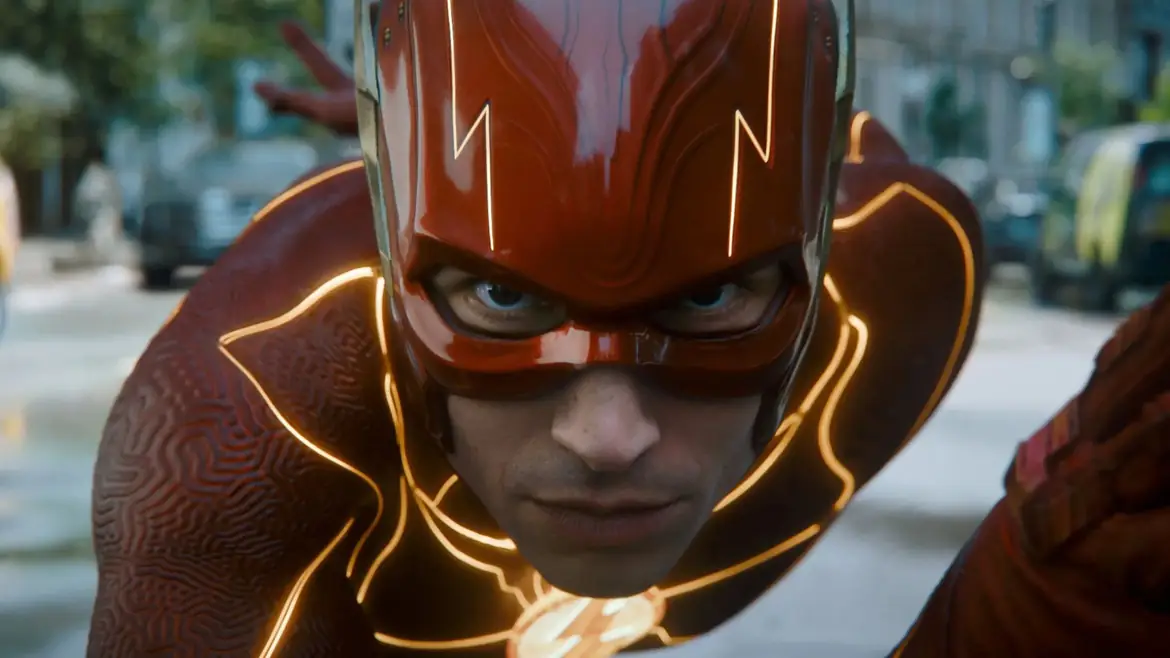

I oversaw animated and short-video display ads during the four-week pre-release window. Each version led with a reason to watch and linked to a showtime.
Match the opening to the viewer’s interest.
Give viewers a reason to choose a screen.
Keep ticket information easy to reach.

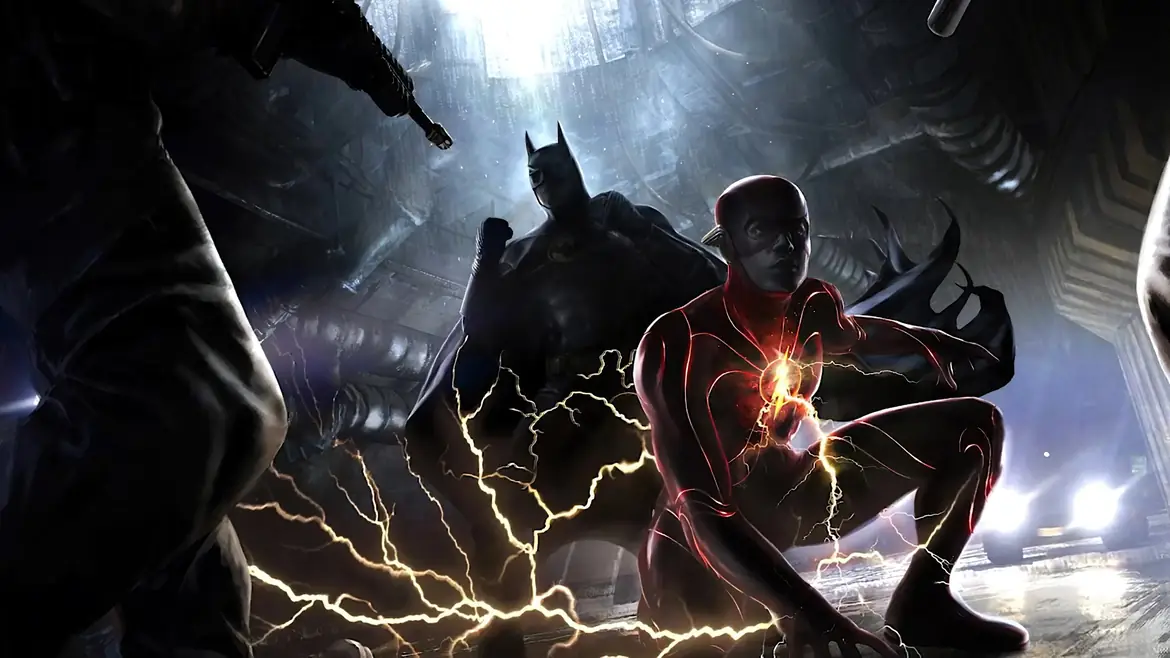

Trailer-to-presale conversion against the studio’s benchmark for comparable summer releases.